Blue is the colour of peace. Its enthusiasts defend it strongly. There’s no comparison in their eyes. Yellow? Too pale, lacks punch. White? Blank, oblivious and completely flat. Green. Makes you feel sick or depressed. And as they say, what is purer and beautiful than a May sky?
For them blue is the colour of love, but a peaceful love. Red? Too intense, too aggressive, too invasive. Blue is long peaceful happiness. It is also the most widely used colour in Quebec households, a title that is likely rivalled by white on occasion.

Blue is hitting hard again this year. We see its aqua vintage hue everywhere: large surfaces, furniture, rugs, bedding, curtains, dishes, place mats, cushions, storage boxes, shelves. It’s a bluish-grey that reflects gentleness. We saw a place where it covered the floors and walls, doors, and window frames. Everything was shaded in blue from one end to another.
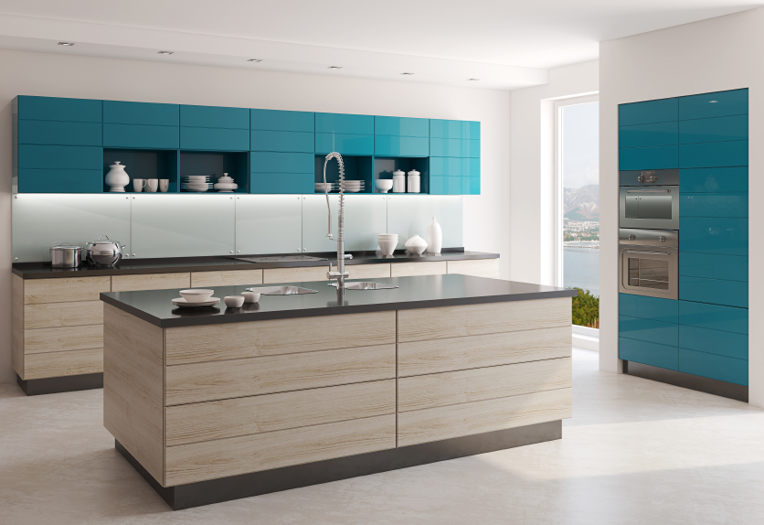
This vintage blue is often seen with natural or white wood, regardless of the room: bathroom, kitchen, bedrooms, living room. Sometimes black and grey highlight vintage blue. The effect is very decorative.
A sky blue combined with white makes you feel like you’re on a Greek island. Note the notions of happiness and peace that are repeated: the sky, the sea, the blue and white of Greece.

More vivid, royal blue spreads throughout the furniture and fabric. In its presence, white becomes whiter, almost sparkling. It’s the beauty of the contrast.
On the contrary, midnight blue and navy blue are both discreet, lending themselves quite well to a felted décor. However, when mixed with orange, these two shades of blue become much more flamboyant. When they follow a Scandinavian model, these two shades of light blue blend perfectly well in an ochre and brown décor. White and cream also work quite well. In short, any decorative landscape in need of calmness.

Seen in a Paris apartment: a pale blue floor with a bronzy table. The ceiling was half ochre half silver. It was an astonishing look.

A bluish white associated with a steel blue is ideal for industrial style enthusiasts, as long as metal is part of the picture.
At the other end of the spectrum, romanticism winds its way through lavender blue while ocean blue sings seaside décors.
In the end, peace is a personal thing. Many of us find it in white, yellow, grey or earth tones. The important thing is to live fully and peacefully.
Photos: istock.com