Turquoise has very few takers in decoration. Yes, we are delighted by the turquoise waters of the Pacific islands, we contemplate the turquoise of the sky, we sigh in envy when we see a turquoise pearl, our eyes widen in front of turquoise satin sheets.
So where does this reluctance come from?
Turquoise doesn’t have the raging glow of red, or the revitalizing dimension of blue, or the sun-drenched side of yellow. It doesn’t have the flexibility of white or black, but it does provide a discreet and light elegance that has nothing to do with violet, a heavy, flashy colour. Like white, turquoise exudes an air of softness, peace and freshness.
It may be because of its slightly bleached aspect that it is hard to apply turquoise over a very large surface. A turquoise room risks becoming heavy over time since, like pink, it is very invasive.
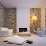
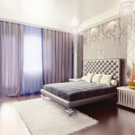
Turquoise is at its best when there’s contrast. The blue and turquoise motifs of Islamic architecture evoke admiration, a white and turquoise bedroom give the impression of soft tranquility, while a black and turquoise veil above the bed attract attention.
Have you ever seen a brick wall littered with touches of turquoise? It’s magnificent. Carpets with a brown and turquoise motif provoke the same effect.
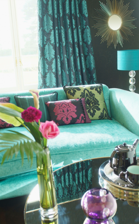
Recently at a friend’s place I saw a turquoise curtain floating above a piece of black furniture on a white background. The contrast was striking. These three colours together give a pepper effect.
If you’ve ever driven in the French countryside, you’ve likely seen the turquoise windows, doors and shutters that make these country homes so charming.
A derivative of blue, a rather relaxing colour, turquoise has a calming effect when combined with white, beige or grey. It is chic and sumptuous when it flirts with black. It reinvigorates when it is associated with chocolate. It catches the eye when it is blended with a dark charcoal surface.
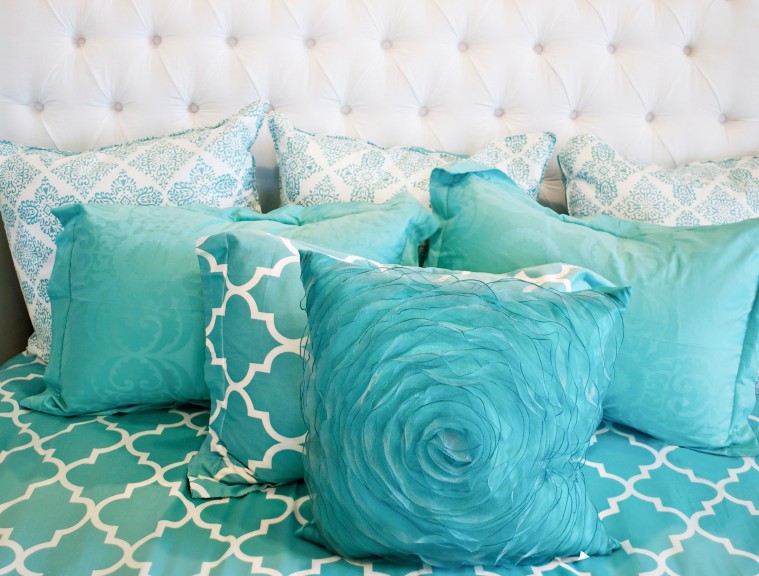
In small doses, it stands out in a decorative space: a woven basket on a turquoise background, a jewellery box overflowing with turquoise gems, stones, wallpaper with a turquoise thread.
Fans of antique deco antique know how to juggle with turquoise. Maroon that appears under a wood wall painted turquoise gives a retro effect. As does a turquoise vase placed in a corner. Remember the turquoise tiled floor on a maroon background, popular in the 60s and 70s, which has never achieved the popularity it once had.
Amateurs of the cold and industrial look like metal painted turquoise with a neglected aspect that provides a look of impurity and imperfection.
Why the word turquoise? Because the stone passed through Turkey from Iran, where it is produced. That is why it was called the “Turkish stone” at one point.
The word turquoise refers to a mineral whose colour varies between clear blue and green apple. That’s where the expressions turquoise blue and turquoise green come from.
References:
Wikipedia turquoise article (stone)
Wikipedia turquoise article (colour)
Photos: iStockphoto LP