It is disruptive, bothersome, eccentric. Yet, there is a way to use red, the colour of love and joie de vivre, without overpowering a room. Let’s take a closer look.
Some rooms we’ve seen are entirely red, from top to bottom, including the furniture. They are, how can we put it, festive and flamboyant, but still bearable. Why? Because, different shades of softer and more subdued reds, like brick red or cherry red, came to tone down the fire-engine red, which dominated the rooms.

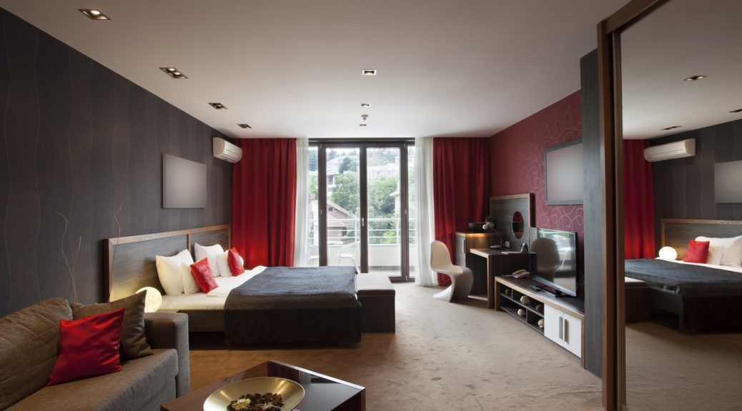
Red has a striking elegance but can show restraint if used properly. A single wall painted in red, or even half a wall, can add a healthy dose of cheerfulness to a room without being overpowering. Red is so rich and upbeat. Why go without it?
A single touch of red can liven up a room, such as the back of an unglazed bookcase, the back of a dining room cabinet, the kitchen island or the backsplash under the cupboards in the kitchen, the steps of the staircase, the window curtains or bed curtains, the wall rug or area rug.
Red can also emphasize an object we are proud to own. For example, a bright red pillow placed on a prestigious sofa or armchair, a red base under a valuable trinket or a red fabric flowing down a magnificent wicker basket.

Red looks stunning when paired with wooden furniture, trim, floors and ceiling beams, especially if the wood has red undertones. It also couples well with copper and metal, a pairing most suitable in bathrooms and kitchens. Chinese red spits fire if paired with black. Perfect to make a room stand out. A softer red will meet black in a classic setting. Featured somewhere: a beautiful, rich dark brown coloured wood trim in a room where red, violet and black came together as one. It was a remarkably beautiful decor. Although red can create spectacular contrasts when paired with blue, forest green, lime, or pink; red can also become more sober when paired with ochre, cream, grey and white. Speaking of white, a red line painted across a white room prevents it from slipping into monotony.

Red is known to make gold stand out. The effect is stunning and beautiful! A mix of wealth and splendour, worthy of any castle.
There are different reds for all tastes. The classic style prefers a modern, rich burgundy red, satiny red and crimson red. To enhance the classic decor, different textures come in play: the red will be dry-brushed, applied with a cloth or sponge or given a marble or velvet effect.

The exotic style will go for a mix of reds and burnt oranges. The rustic or shabby chic will prefer a strawberry or raspberry red. As for the contemporary and industrial styles, coca-cola red is the way to go.
Every room opens up to red. Since red is the colour of passion, no use concentrating on the bedroom. Let’s go into the bathroom. There, a startling new discovery lies ahead. Notice a delicate red, paired with brown woodwork, grey furniture and grey flooring in a setting stripped away by violent lighting. This room emanated a profound sense of intimacy.

A cheerful wallpaper or a tomato red adds joy to a kitchen, the ideal gathering place. Now, imagine if the floor was in terracotta!
Image: iStock.com