Tag Archives: shabby chic

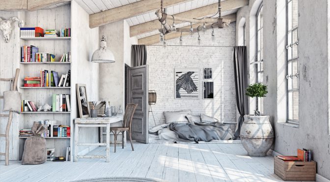
Perfection does not exist in a shabby chic decor and that’s exactly what makes it so charming. Distressed but vibrant furniture overshadows new furniture. It fits easily into this decor that is soft, joyful, organic, and let’s admit it, a little bohemian. Shabby chic is silky-soft. At the heart of this style is distressed furniture. As if the wood was worn out by sea salt, or simply over time. The furniture looks like the kind you would find at a flea market or antique store. You can see the wood through the cracked paint. In some instances, several coats of paint let different layers of colours peek through.

Shabby chic becomes a full-blown style when the walls, ceilings and floors also have a worn-out look, if not to say neglected. The whole room seems weathered. Almost everything looks distressed but without the dusty and old appearance of antiques or the tacky and playful side of pure vintage.

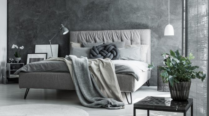
[caption id="attachment_16768" align="aligncenter" width="600"]
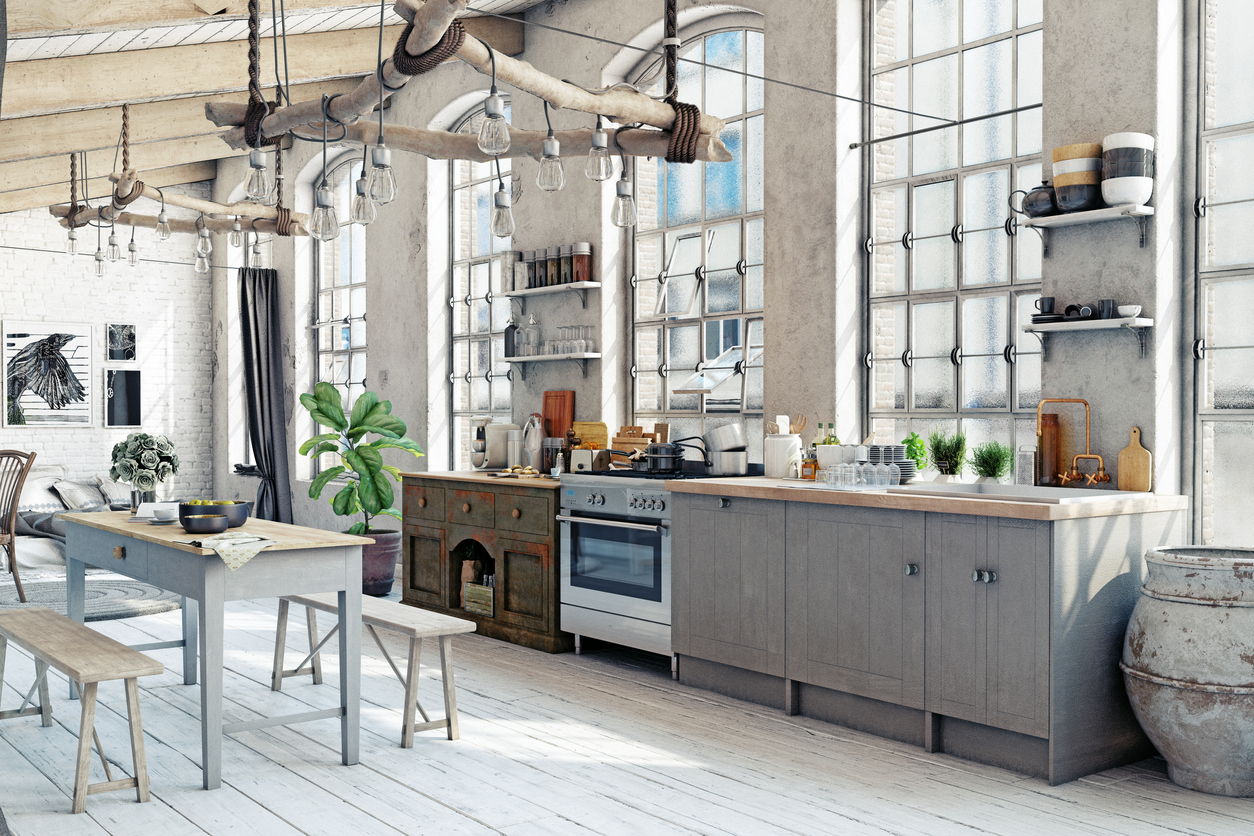
iStock iStock[/caption]

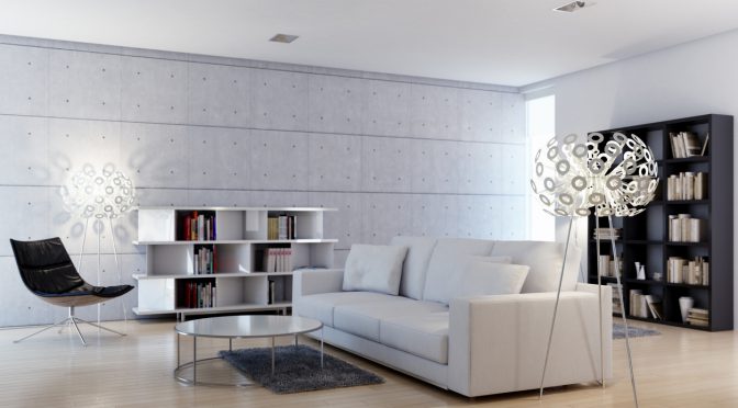
Shabby chic can be mellow and not so mellow. The first variant gets all of its potential from a stark and sober decor, almost bare, where the furniture takes centre stage to express the style. The second alternative welcomes various decorative accessories: candlesticks, crumpled fabrics, dried flowers, patchwork, glazed silver. In this instance, shabby chic meets vintage.[……]

Read more

Is it a crime to talk about a colour as dull as grey when spring is right around the corner ready to show off its vibrant colours? Not at all. On the contrary! Grey is a lively colour once you learn how to adopt it. Who knows, maybe it’s the colour you’ve been looking for!

[caption id="attachment_16529" align="aligncenter" width="585"]iStock iStock[/caption]

Grey is a neutral colour, like black and white. It is the perfect backdrop to make all the colours of the artist’s palette stand out, from lime green to yellow, followed by pink and purple. However, unlike white and black, the contrast is less intense with grey. It is much softer. Grey’s main attribute — its magical trait so to speak — is creating contrasts in a soft and cozy atmosphere.[……]

Read more

Some believe this design is too cold. Yet, it seems the contemporary style offers continuous appeal since so many people choose to adopt it. Even after so many years, these elements are still sought after: clean lines, open spaces, plenty of natural light and decorative furniture.

What’s astonishing when we enter a contemporary-style room is the illusion of a never-ending space. The furniture is often built into the walls and partition walls, the lights are mounted in the ceilings, and the room is bare. Everything is clean, fresh and unadorned.

[caption id="attachment_16186" align="aligncenter" width="580"]iStock iStock[/caption]

Huge windows or even walls made entirely of glass, allow the indoors to expand into the outdoors while flooding the room with natural light. Since the living space is bare and there are windows everywhere, the natural light brightens up the room.

[……]

Read more

The two-toned kitchen cabinet trend is in full swing: one colour for the upper cabinets, another one for the lower cabinets, or a different colour for the cabinet doors. Imagine all the possibilities!

Pairing two colours for the cabinets can instantly revive the whole kitchen, regardless of the colours you choose, whether they are lively or dark hues.

Now, close your eyes and imagine these combos: orange and brown, gold and brown, eggplant and anise green, orange and violet, blue and gold, blue and grey, turquoise and beige, turquoise and chocolate brown, grey and purple, yellow and cream, black and ochre. And the list goes on.

[……]

Read more

It is disruptive, bothersome, eccentric. Yet, there is a way to use red, the colour of love and joie de vivre, without overpowering a room. Let’s take a closer look.

Some rooms we’ve seen are entirely red, from top to bottom, including the furniture. They are, how can we put it, festive and flamboyant, but still bearable. Why? Because, different shades of softer and more subdued reds, like brick red or cherry red, came to tone down the fire-engine red, which dominated the rooms.

[caption id="attachment_14870" align="aligncenter" width="599"]iStock iStock[/caption]

Red has a striking elegance but can show restraint if used properly. A single wall painted in red, or even half a wall, can add a healthy dose of cheerfulness to a room without being overpowering. Red is so rich and upbeat. Why go without it?

A single touch of red can liven up a room, such as the back of an unglazed bookcase, the back of a dining room cabinet, the kitchen island or the backsplash under the cupboards in the kitchen, the steps of the staircase, the window curtains or bed curtains, the wall rug or area rug.

Red can also emphasize an object we are proud to own. For example, a bright red pillow placed on a prestigious sofa or armchair, a red base under a valuable trinket or a red fabric flowing down a magnificent wicker basket.[……]

Read more